Theme Builder
Customize the look and feel of the Ask Sage platform to match your organization's brand
Table of Contents
Administrators can customize the appearance of the Ask Sage platform for their organization using the Theme Builder, found under Branding in the Admin Panel sidebar. Theme Builder pairs a configuration panel with a live preview of the actual chat interface, so changes can be reviewed before they’re applied.
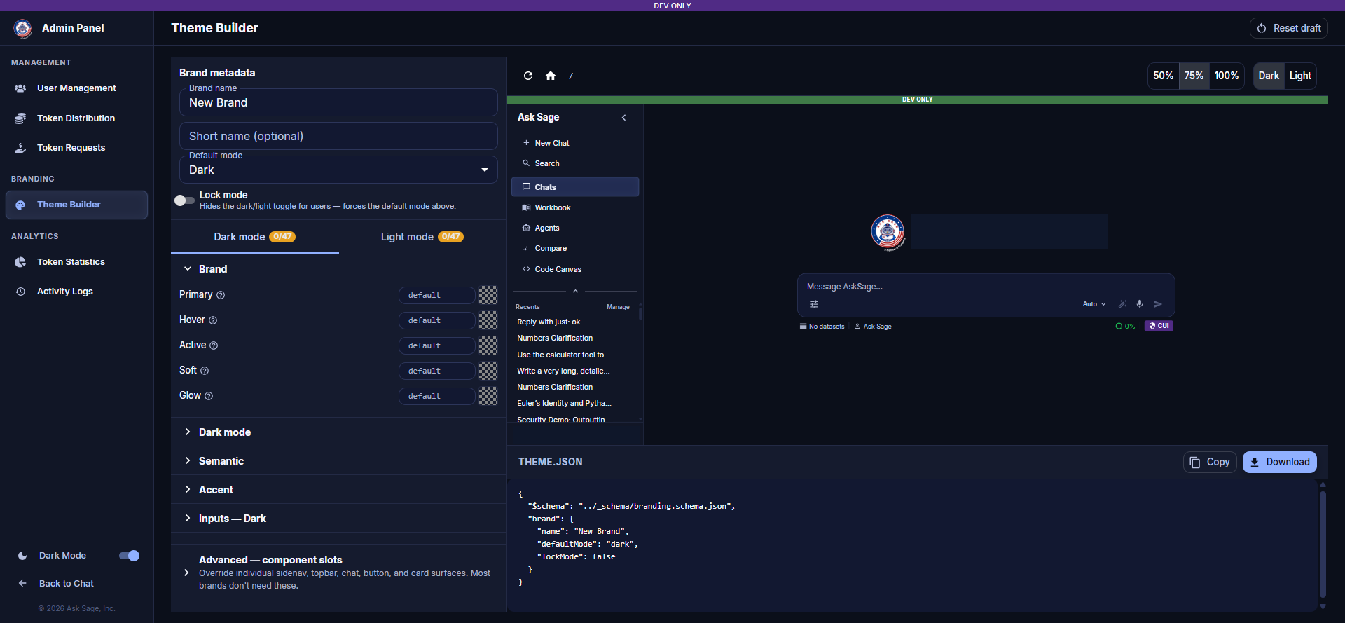
Theme Builder — Configuration Panel and Live Preview
Brand Metadata
The top of the configuration panel captures the identity of the theme:
- Brand name — the display name for this theme (e.g., "New Brand")
- Short name (optional) — an abbreviated name used where space is limited
- Default mode — whether users start in Dark or Light mode
- Lock mode — when enabled, hides the dark/light toggle for users and forces everyone into the configured default mode
Dark Mode and Light Mode Tabs
Color settings are configured separately for Dark mode and Light mode using two tabs. Each tab shows a counter (e.g., 0/47) indicating how many of the available color values have been customized away from their defaults.
Within each mode tab, settings are organized into collapsible categories:
- Brand — the core brand colors: Primary, Hover, Active, Soft, and Glow. Each has a text input (defaulting to
default) and a color swatch. - Dark mode / Light mode — mode-specific surface and background colors
- Semantic — colors used for status and feedback (e.g., success, warning, error states)
- Accent — supporting accent colors used throughout the interface
- Inputs — colors for form fields and input controls
Advanced — Component Slots
The collapsed Advanced — component slots section allows administrators to override individual sidenav, topbar, chat, button, and card surfaces beyond the standard color categories above. Most organizations won't need this level of control — it exists for brands with more specific design requirements.
Live Preview
The right side of the Theme Builder renders a live preview of the actual Ask Sage chat interface, updating as color values change on the left. Use the controls above the preview to:
- Zoom the preview to 50%, 75%, or 100%
- Toggle the preview between Dark and Light to check both modes
- Refresh the preview or navigate it back to its home state
Exporting a Theme
Below the live preview, the THEME.JSON panel shows the full generated configuration as JSON, including the brand metadata and every color value. Use Copy to copy the JSON to your clipboard, or Download to save it as a file.